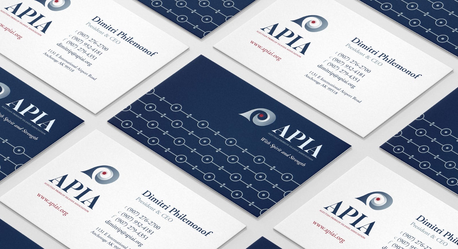
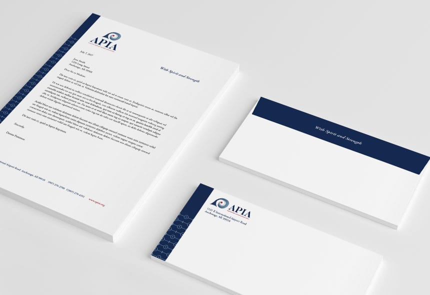
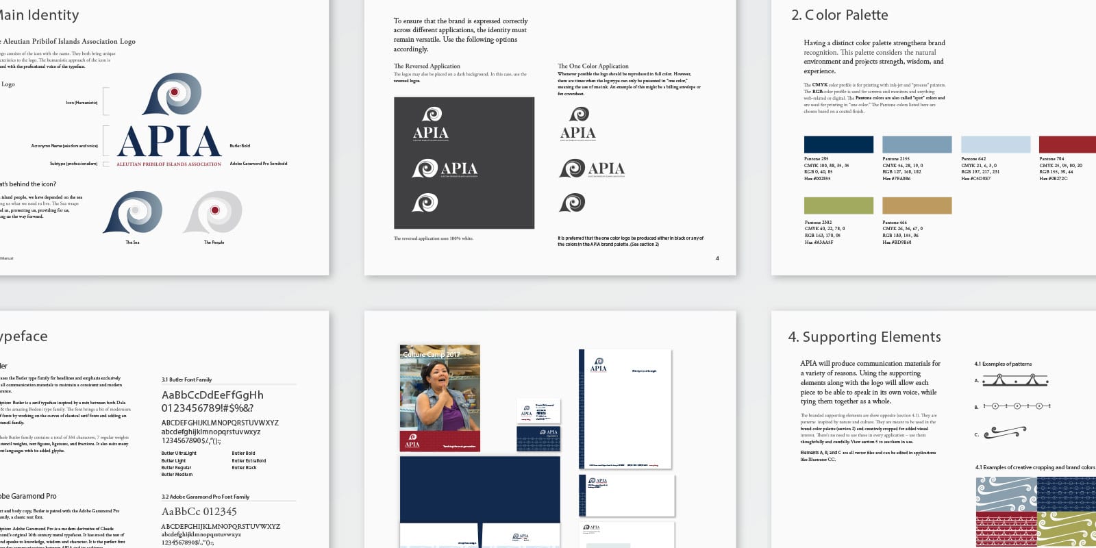
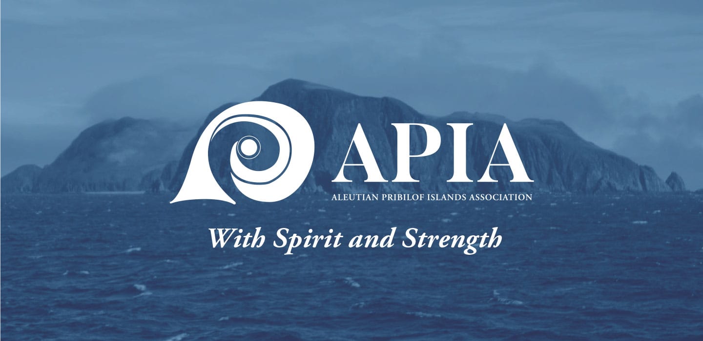
fbpx

This is where we started

When APIA first approached Element, it was for help with reaching a new audience for their annual Gala event. Our team, however, quickly realized APIA had nothing that communicated who they were, what they did or how special their organization was – their building was blank, their ‘logo’ was a map of the Aleutian and Pribilof Islands (hard to replicate or scale) and there was no cohesive visual identity for staff, volunteers and community members to identify with.

Solution

Element Agency proposed and launched a rebranding effort with key members of the APIA staff. We started with getting to know the organization – the culture, the history and the future. After an iterative moodboard process, we landed on the inspiration that defined the direction of the new APIA identity.

We developed an inspired logo mark for APIA, and the supporting graphic elements to carry it. Additional services included updating the business stationary and collateral for the organization, designing a ‘reveal’ brochure for analog stakeholders, and creating a two (2) minute video that communicated the essence of the organization, it’s new identity and it’s future.

Result

APIA’s new identity was a hit with board members, staff and community members alike. At their brand roll out and at a recent Culture Camp, the APIA Board President and CEO highlighted the collusion of the new mark, the youth, and the future of the organization with, “This is the future.”

A strong brand identity can go a long way in reinforcing your organization and in helping you reach new audiences. In the case of APIA, it helped drive their organization and mission forward into the future. As for the Gala we were asked to help plan? It too was a smashing success.

All Posts